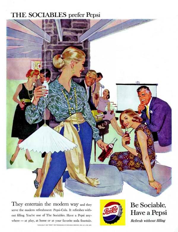
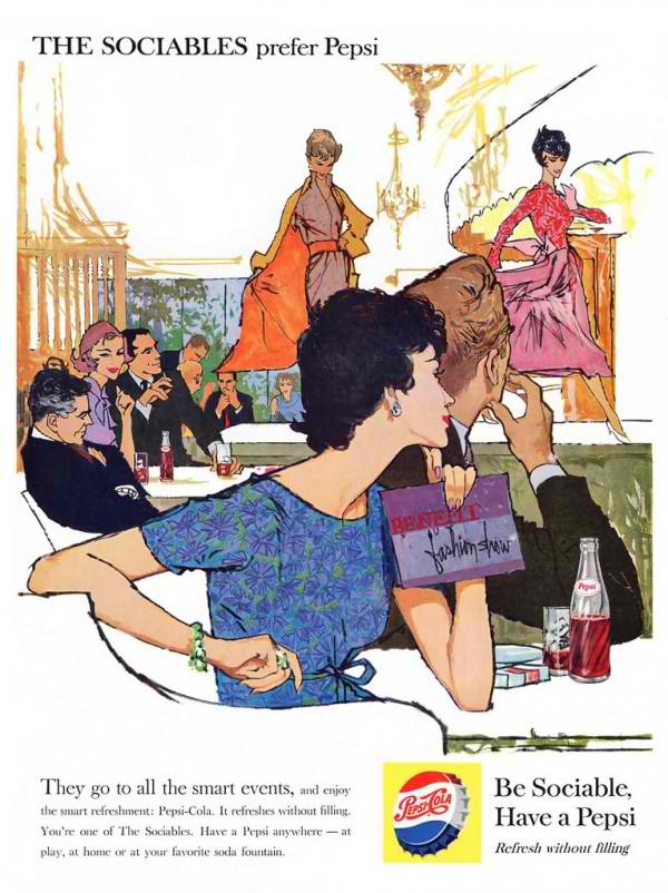
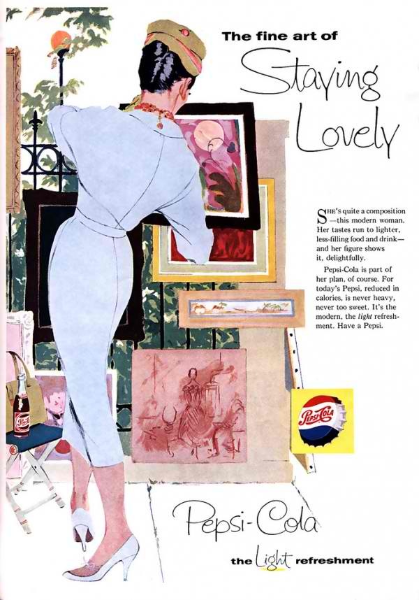
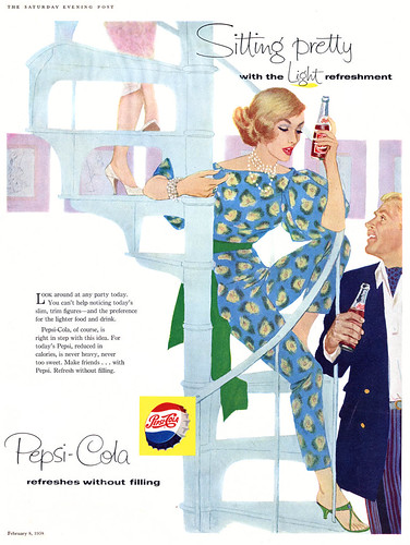
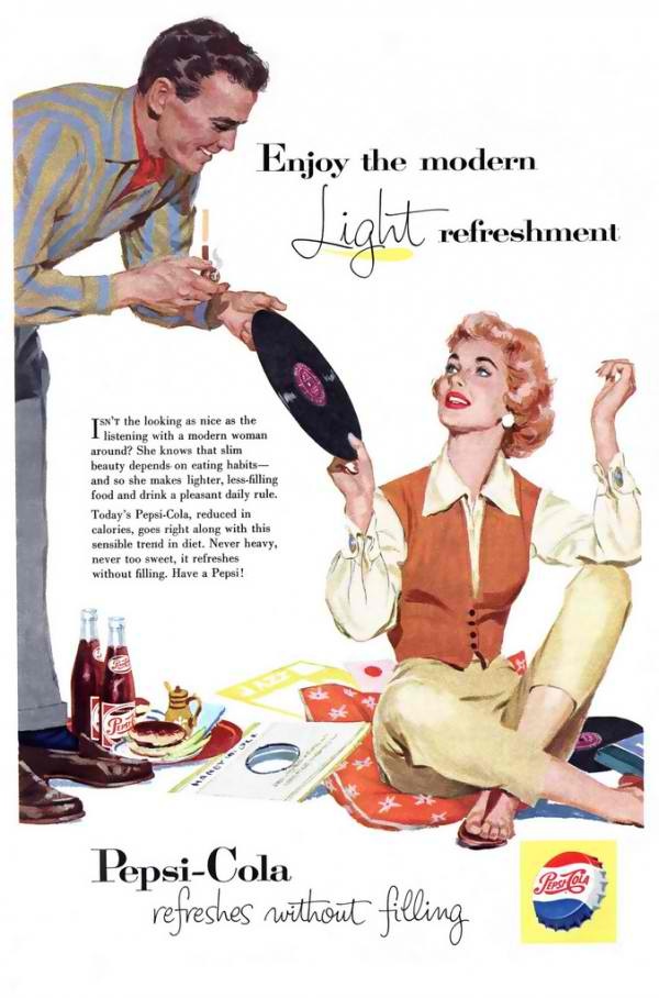
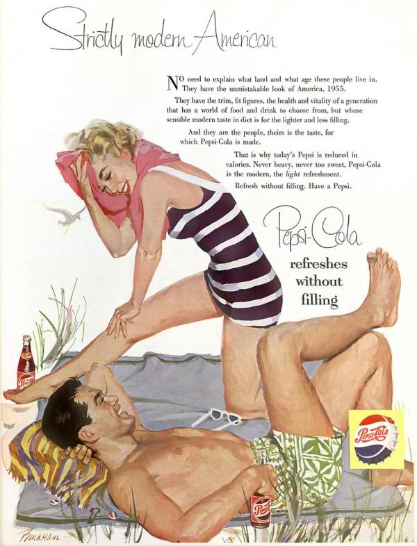
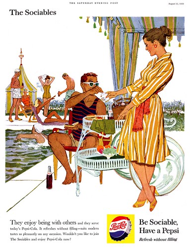
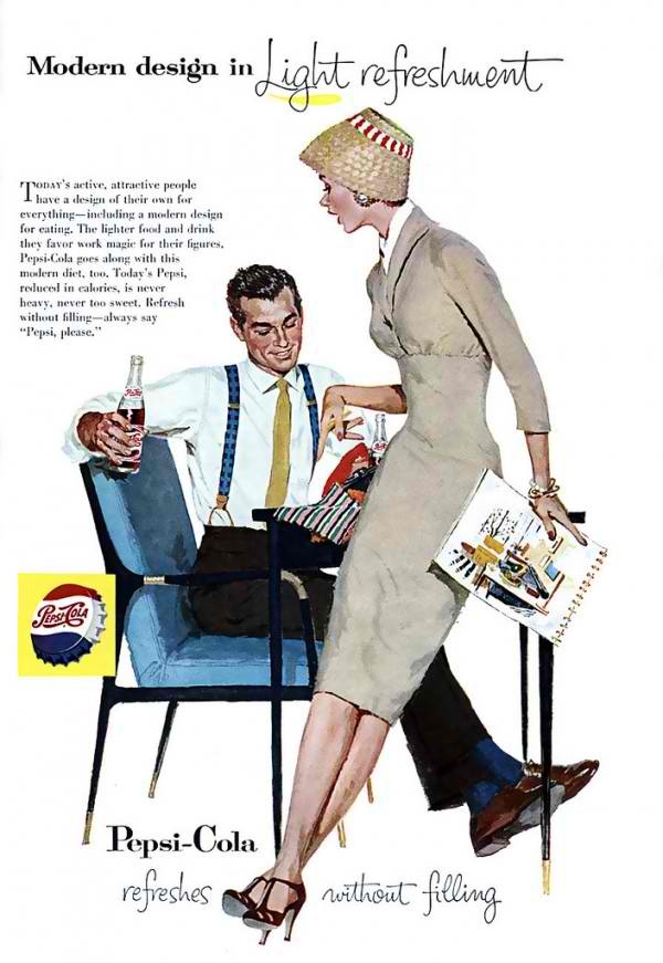
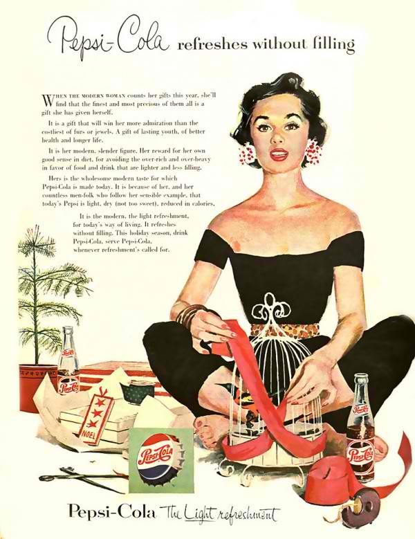
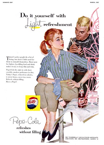
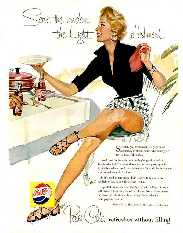
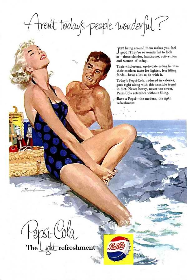
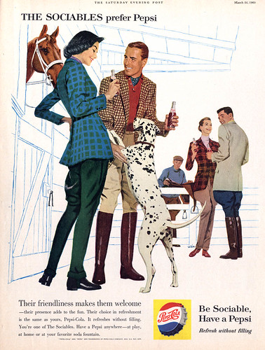
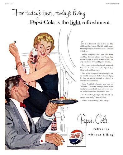
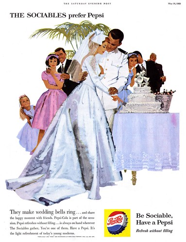
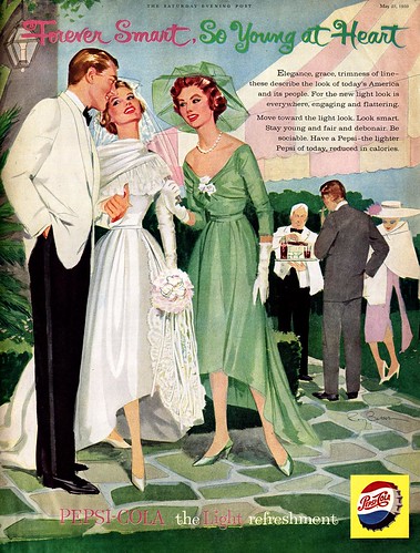
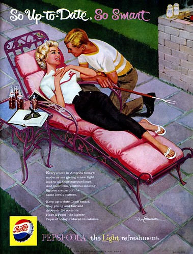
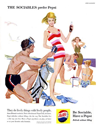
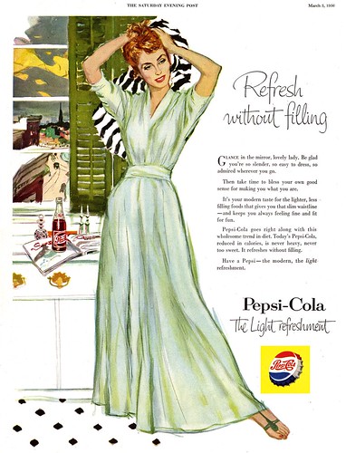
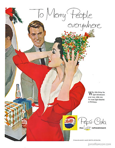
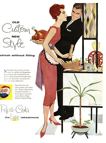
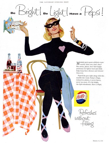
These beautifully illustrated Pepsi advertising campaigns from the 50s and 60s have just about made my day. I love the way each one has its own story like a snapshot from a moment in someone’s life whether it’s just a day at the beach, sitting front row at fashion week, hanging out in the kitchen at a halloween party or cutting the cake on their wedding day. But undoubtedly what’s most impressive about these illustration is the detail that has gone into the clothes, the patterns and the design of the spaces around the characters. Unfortunately we don’t have the name of the illustrator but I’m certain he/she must have worked as a fashion illustrator.
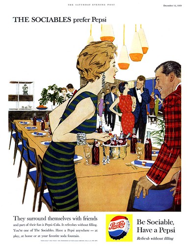
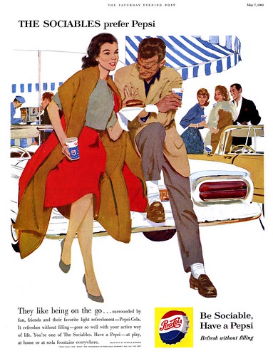
‘The Sociables’ was the hit campaign of the 60s that suggested the drink could somehow cure introverted people while the ‘The light refreshment’ series aimed at targeting youngsters who were more concerned about their appearance.
Of course one of my favorites has to be the one below, set in Paris.
Coolest-looking pool party I’ve ever seen!
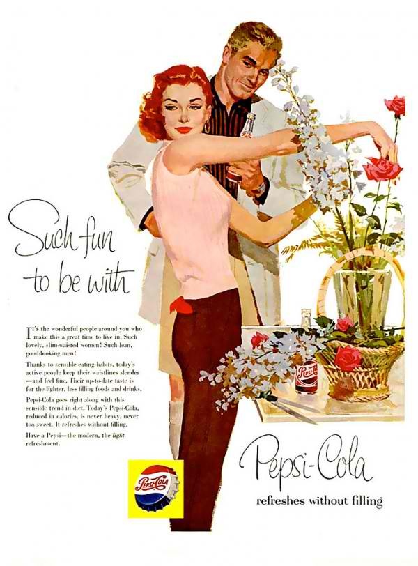
Very Liz Taylor-inspired…
Loving her moccasins!
Stunning 50s summer outfit, love the crisp black blouse with those jacquard short shorts.
Check out the detail in all that tweed!
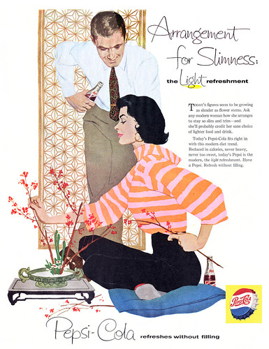
Great sweater, plus notice 60s asian interior influence..
The stairs is always the best place to sit at a party…
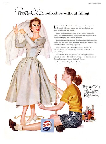
So Officer and a Gentlemen! Lovely moment translated through illustration!
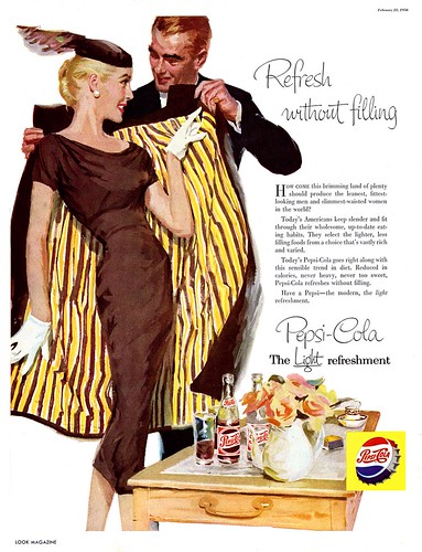
What a coat! Is this advert really about a fizzy drink?!
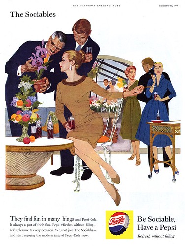
Rattan furniture must have been all the rage this year…
Adore the prints all thrown together. Outfit inspiration!
I wonder what city that is outside of her window…
Also how elegant does she look in her bloody bathrobe!
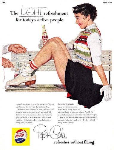
I can certainly see why these were such successful campaigns. I’m captivated. We should have more creative advertising like this today. Why not combine advertising more with real art and skill? I hope you enjoyed them!
Images found via Pinterest and Flickr here and here

