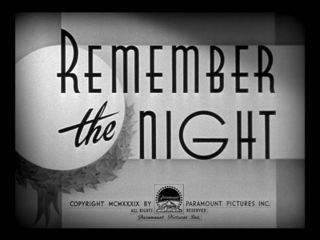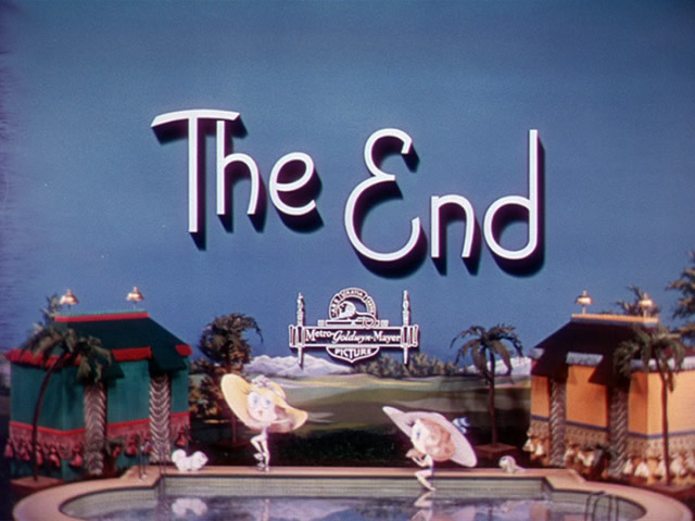
Movie title typography is a lost art in my opinion. Hollywood today just doesn’t put that same pizazz (yeah I’m gonna use that word) in to their opening or ending title sequences anymore.
Christian Annyas designs websites in between in his morning coffee and his evening movie and boy, has he watched a lot of movies over the years…
“To prove I’ve sat through at least the first ten minutes of them I started making screenshots of the titles. Then my computer crashed and I almost lost them all. To save them for future generations I created this little website.”
His little website is The Movie Titles Stills Collection, an online archive of hundreds of movie-stills organised by decade, featuring stunning vintage typography, art and design. And “The End” titles are often as visually interesting as the opening ones. Forget film trailers, these snapshots of cinematic history are enough to make you want to curl up and rediscover a classic film from a bygone era of movie-making.
Here are a “few” of my favourites …
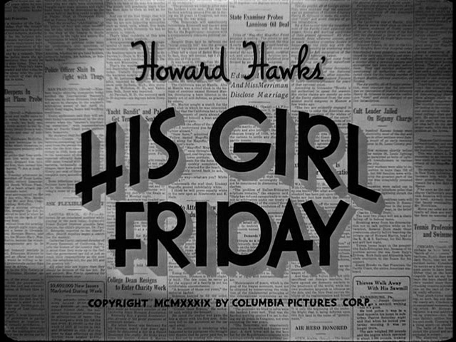
His Girl Friday (1940)
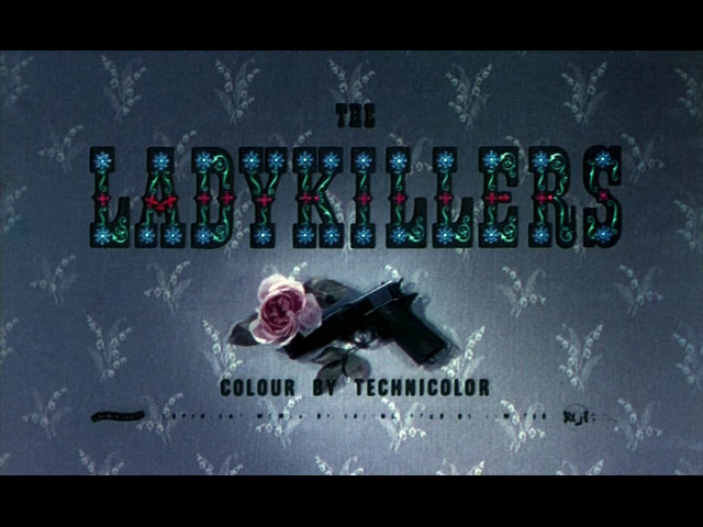
The Ladykillers (1955)
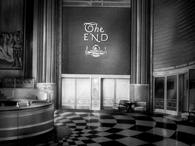
Grand Hotel (1932)
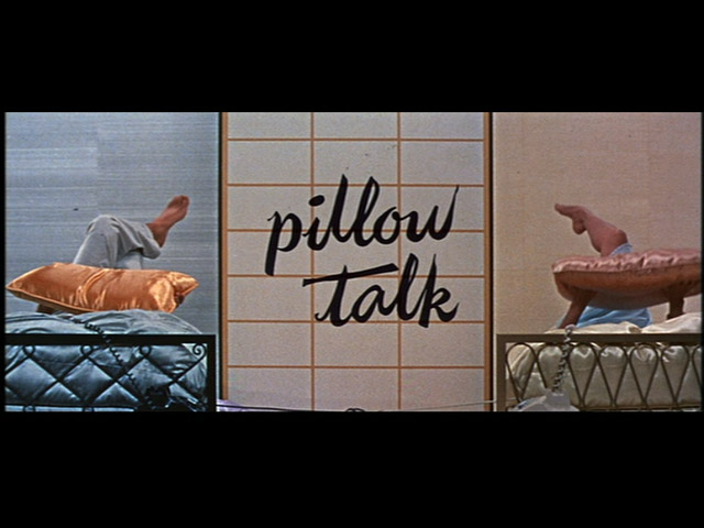
Pillow Talk (1959)
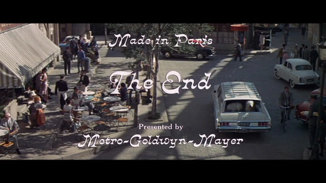
Made in Paris (1966)
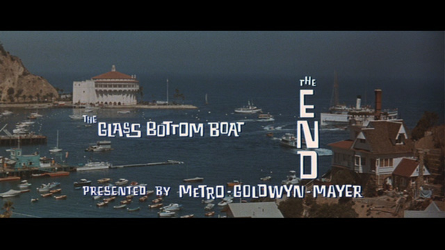
The Glass Bottom Boat (1966)
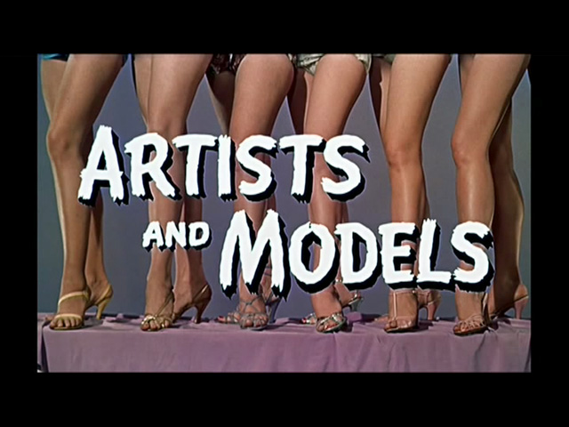
Artists and Models (1955)
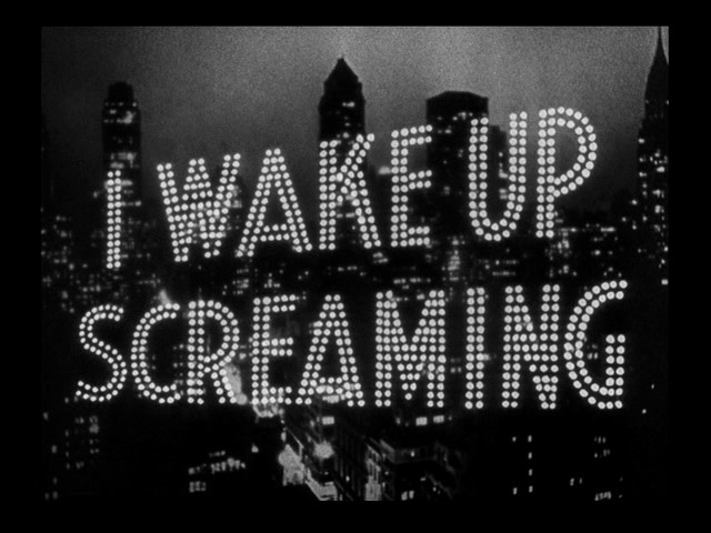
I Wake up Screaming (1941)
A very similar version of that title sequence seems to have been used again a year later in…
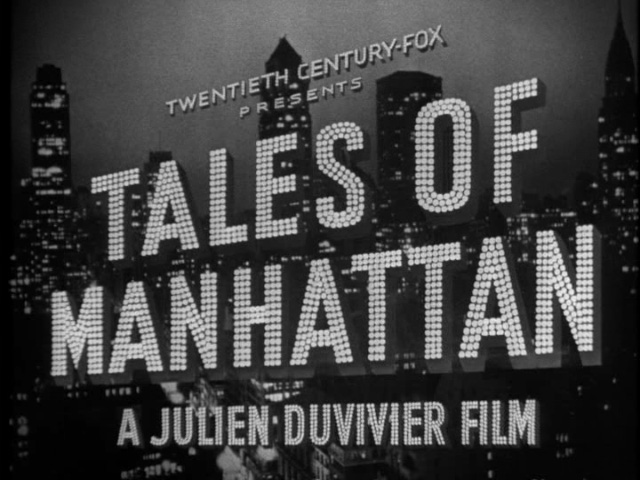
Tales of Manhattan (1942)
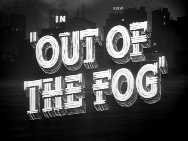
Out of the Fog (1941)
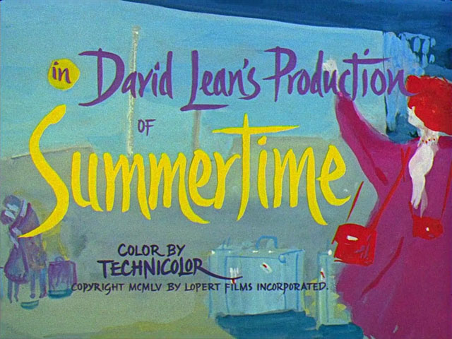
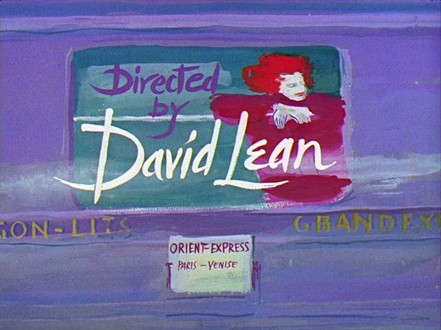
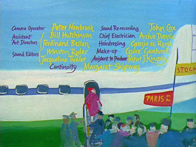
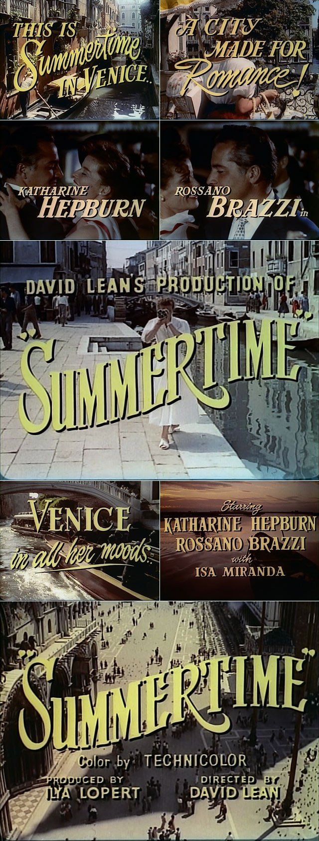
Summertime (1955)
This painted title sequence is so great, I had to share a few more…
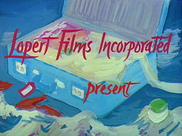
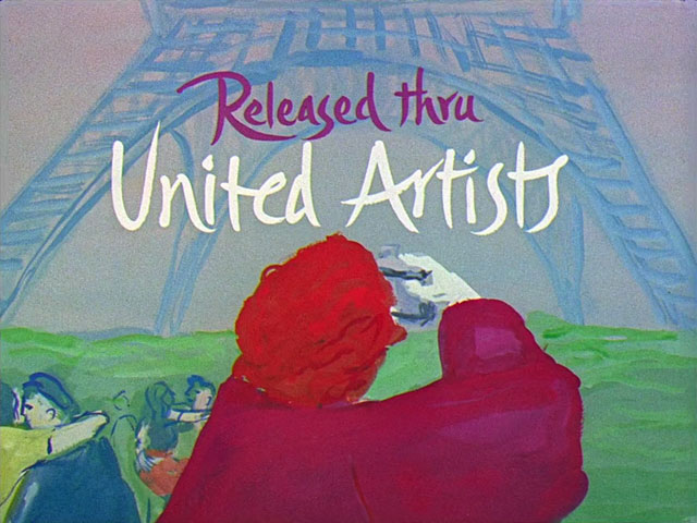
and some technicolor stills from the film trailer…
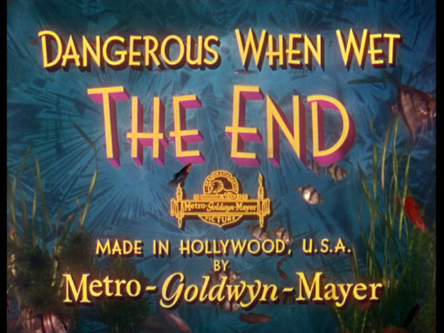
Dangerous When Wet (1953)
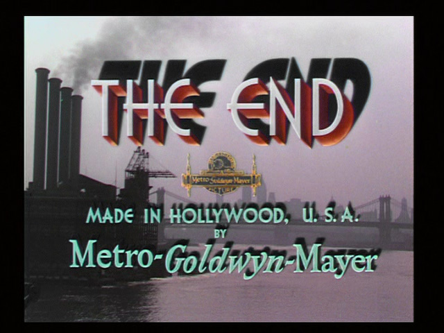
On the Town (1949)
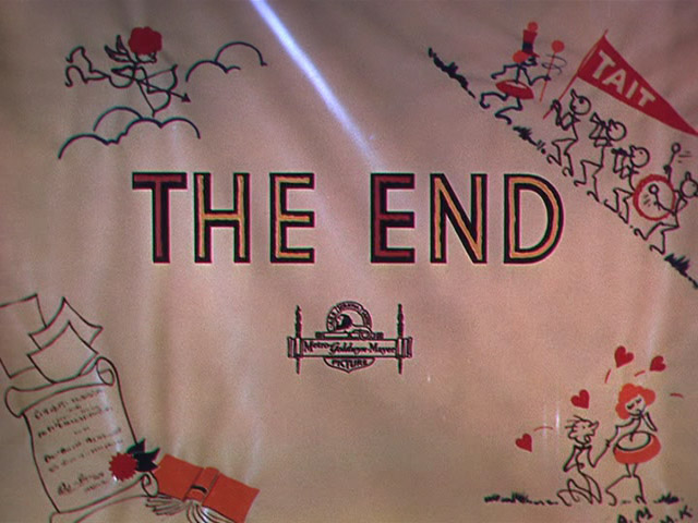
Good News (1947)
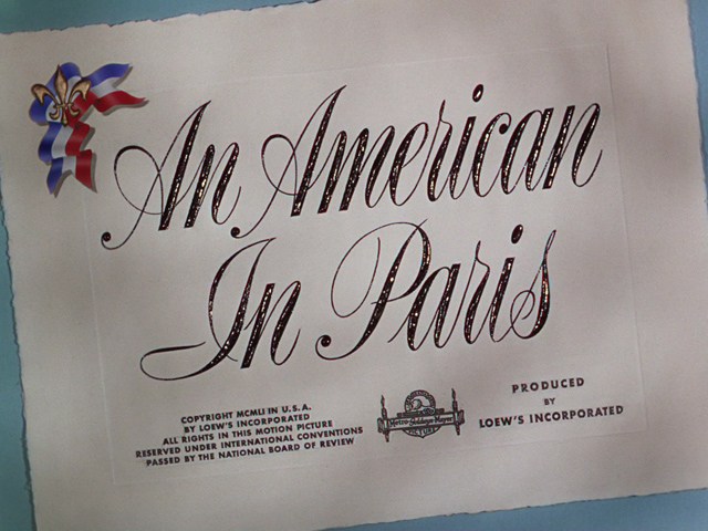
An American in Paris (1951)
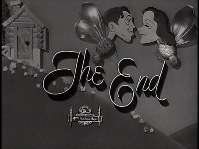
Come Live with Me (1941)
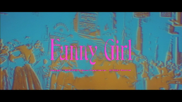
Funny Girl (1968)
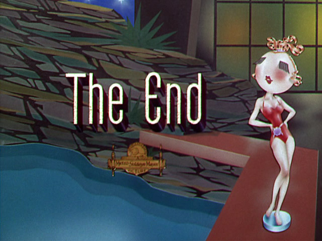
Neptunes Daughter (1949)
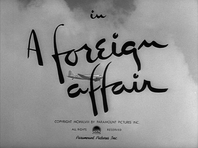
A Foreign Affair (1948)
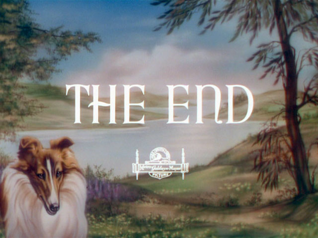
Lassie Comes Home (1943)
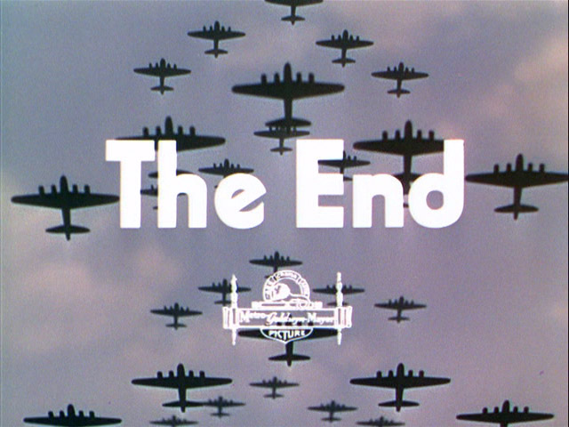
An American Romance (1944)
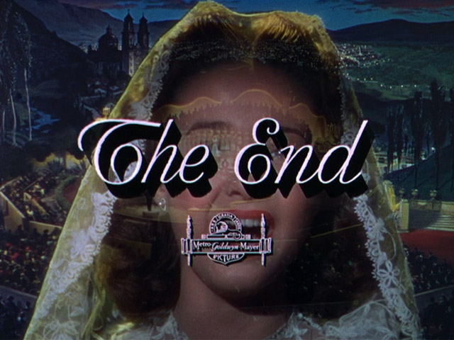
Holiday in Mexico (1946)
Hope you found something for movie night! Check out more of the archives here
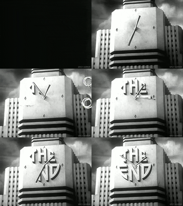
And if you wouldn’t mind some cool movie stills popping up on your Facebook newsfeed every now and then, follow him on his Facebook page

