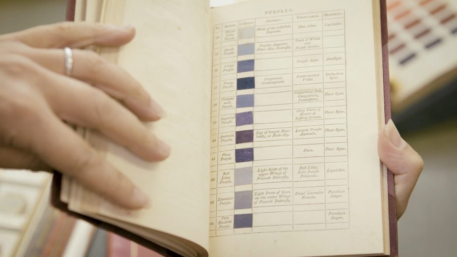
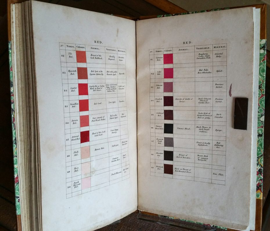
“Streak from the eye of the kingfisher” for a buff orange. “Flower of deadly nightshade” for a brownish purple red. “Decayed leaves of none-so-pretty” for cochineal red. “Beauty spot on wing of Mallard Drake” for a Prussian blue. These were the poetic descriptions inspired by nature to describe colour in a book used by Charles Darwin himself, to catalogue unknown creatures in a strange new world.
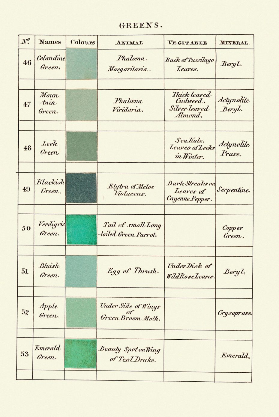
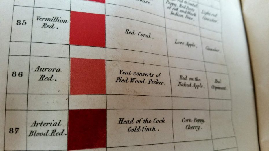
Nowadays, shade enthusiasts wait with bated breath for the release of Pantone’s colour of the year. But in the pre-photography age, a German geologist and Scottish flower painter pioneered a colour coding system that informed the research of scientist and continues to inspire artists to this day. It was a kind of Pantone system for natural scientists. Each shade of colour was given a name and animal, vegetable and mineral examples for it. For example, Emerald Green is the colour of the beauty spots on the wings of teals and emerald gemstones, whereas Pistachio Green is found on the necks of eiders, on “ripe pound pears” and in chrysolite minerals.
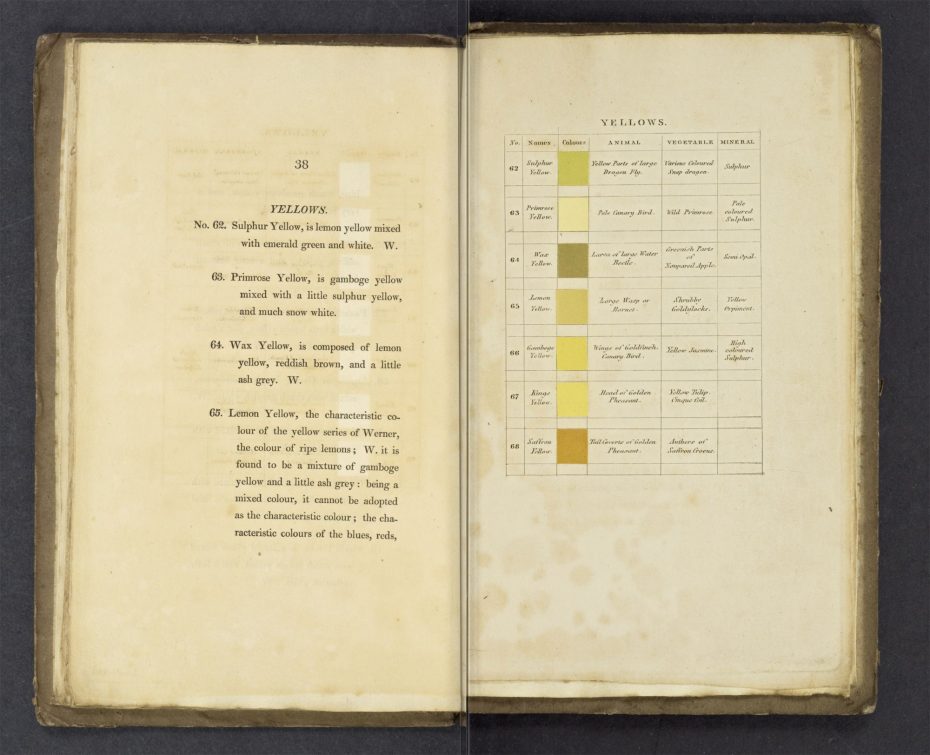
While Abraham Gottlob Werner’s Neptunism theory of rock formation has largely been disregarded, his major work would be used far beyond its initial goal of classifying minerals by descriptors including colour. The book was translated into French and then English before ending up in the hands of Patrick Syme, a painter for the Royal Caledonian Horticultural Society in Edinburgh. Syme amended Werner’s colour samples, adding actual swatches and publishing the more expansive guide, Werner’s Nomenclature of Colours, in 1814. As Syme wrote in the preface, such a resource “has been long wanted in arts and sciences” and he praised the accuracy of Werner’s work.
“It is singular, that a thing so obviously useful, and in the description of objects of natural history and the arts, where colour is an object indispensably necessary, should have been so long overlooked. In describing any object, to specify its colours is always useful; but where colour forms a character, it becomes absolutely necessary.”
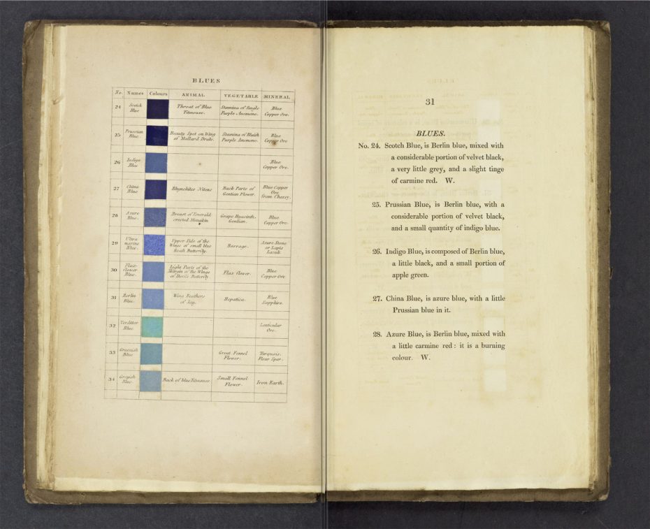
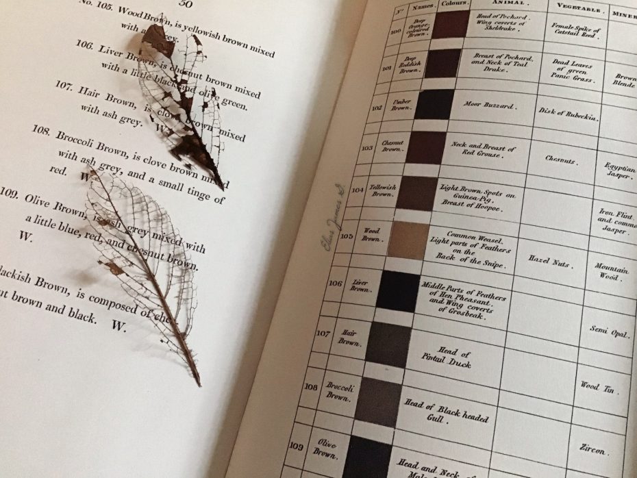
The 110 shades each have a number and a name as well as a list of elements (animals, minerals and plants) that represent the colour. Names were often based on existing elements or places, like Veinous Blood Red or Prussian Blue. The descriptions that accompanied the names were also crucial. For example, Prussian Blue is “Berlin Blue, with a considerable portion of Velvet Black, and a small quantity of Indigo Blue.” It is found on the beauty spot of a mallard drake’s wing, the stamina of a bluish purple anemone and in blue copper ore. Or Straw Yellow, seen in nature in polar bears, oat straw and schorlite and calamine minerals.
Werner’s Nomenclature of Colours helps make unexpected comparisons within the natural world. Most notably, a young Charles Darwin brought a copy aboard the H.M.S. Beagle, which housed a full library. This three-year journey around the world in 1831 would change not only how species were classified but also our understanding of evolution with the publication of On the Origin of Species (1859). Darwin used Werner’s Nomenclature of Colours to identify rocks, natural features and animals including snakes. He once told English naturalist Leonard Jenyns, “a comparison was always made with the book in hand, previous to the exact colour in any case being noted.”
Other environmental aficionados including botanist William Hooker, Arctic explorer William Parry and naturalist Sir John Richardson also relied on the Werner’s Nomenclature of Colours to describe their discoveries both close to home and from far off places. Architecture Digest also points out that in addition to scientific discovery, the 19th century was a period when interest in colour itself was expanding, with the discovery of new pigments influencing the arenas of painting as well as architecture and design.
But Werner’s Nomenclature of Colours eventually lost its influence as the go-to for colour categorization. During this time, scientists also focused on the red, green and blue light (RGB) system to understand and describe colour perception. This led to a more technical understanding of colour in the late 19th and early 20th centuries, with the cyan, magenta, yellow and black (CMYK) system first used in 1906. Pantone, which began as a commercial printing company in the 1950s, developing its Pantone Matching System (PMS) to match specific colours even when they were created with different materials. Its 1,114 spot colours are mixes of 14 base pigments and specific colours are used in flags around the world, including for Canada, South Korea and U.S. states such as Texas.
Pantone has adapted to the digital age and other technology like spectrophotometers are making colour matching more exact than ever. But surprisingly, Werner’s Nomenclature of Colours has gained a renewed popularity in recent years, potentially reflecting a desire to return to more analogue and potentially poetic understandings of colour.
Most notably, this includes former NASA astronaut Leland Melvin, who told New York Magazine’s The Strategist that he would bring a copy of Werner’s Nomenclature of Colours on a mission to catalogue what he sees from the space station.

“I saw the ocean — cerulean, aquamarine, every colour of blue you can imagine, from the deepest blues to the lightest blues. I exhausted my vocabulary for the colour blue in looking at the ocean… That was my aha moment! So many blues. It was so beautiful. Next time I would take with me something that would help me put names to the colours more accurately.”
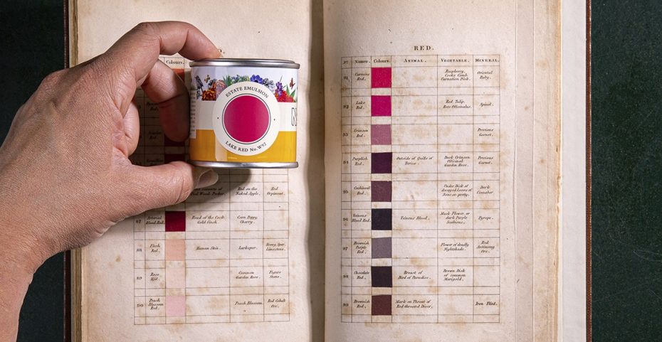
Relying on scans from the Internet Archive, designer Nicholas Rougeux made an interactive version of Werner’s book. Users can explore the colours by tones and with reference images of them in nature. There are even posters of the full colour spectrum and the colour blends that can be purchased and the book became the inspiration for a recent range of paint by Farrow & Ball.
Analogue versions of the text are also back in print: in 2018, Smithsonian Books published the pocket-sized Werner’s Nomenclature of Colours: Adapted to Zoology, Botany, Chemistry, Minerology, Anatomy, and the Arts. This year, Princeton University Press released an expanded version of Werner’s work, featuring illustrations to go along with the colour swatches. Potentially, a new generation of naturalist, adventurers and artists can be inspired to better understand and capture the world around them.

