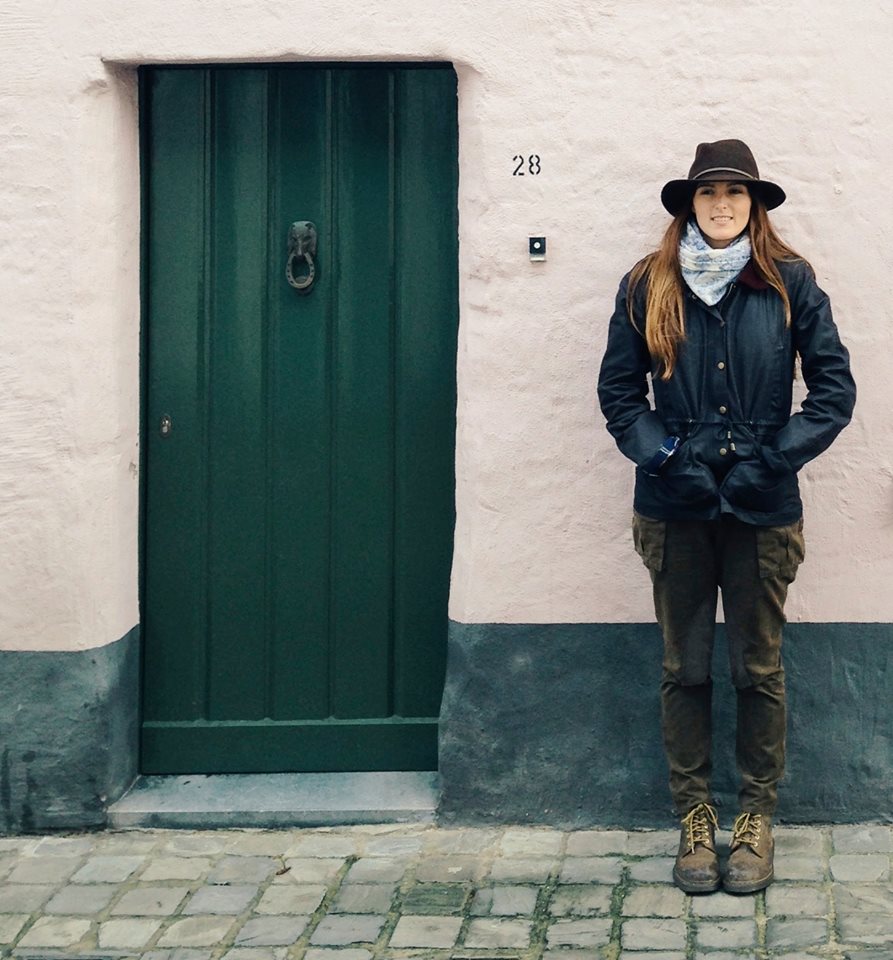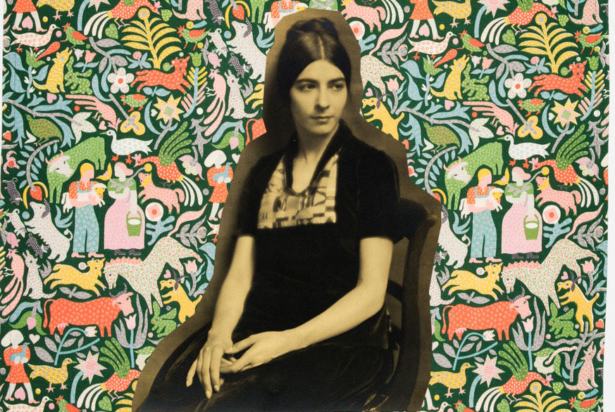
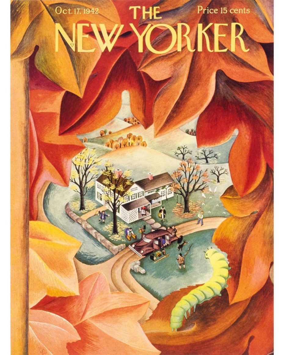
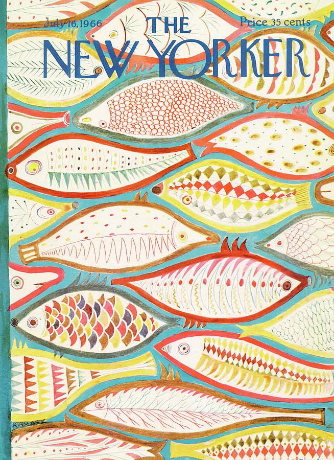
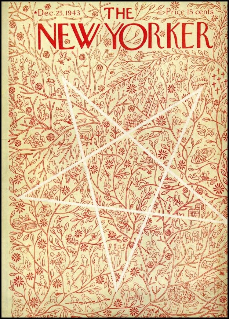
No magazine has a cover style as distinctive, enduring and charming as that of The New Yorker. With its unmistakably unique title font and with almost a century’s commitment to using original artwork on its front cover in every weekly edition since 1925, it’s arguably the most influential magazine ever when it comes to culture, politics and the arts. Ilonka Karasz, a young talented Hungarian émigré would provide 186 of these intense, rich and colourfully painted vignettes of American life over five decades – the second most of any artist in the magazine’s history. Hauntingly striking with her long jet-black hair and soulful eyes beneath heavy black eyebrows, wearing colourful bohemian dresses; she was the Hungarian incarnation of the Mona Lisa. Unlike the famous painting, however, many in the arts world today are still oblivious to this unsung design hero.
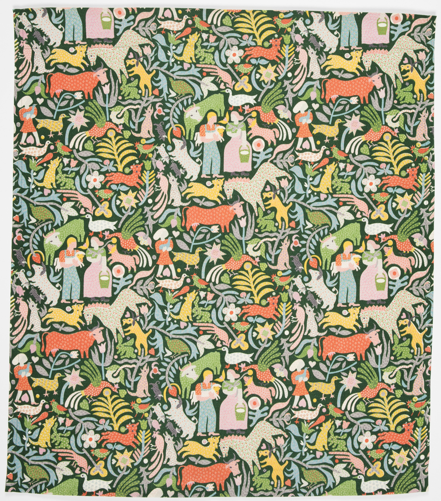
In the late 1910s New York’s free-spirited Greenwich Village was flooded with creative bohemians but Ilonka Karasz stood out from the crowd. Those in the know will enthusiastically testify to the genius of Karasz. Few other artists can boast a portfolio that equals hers in diversity, quality or proliferation of output. It’s almost unfathomable that one creative mind could so effortlessly move around in the multimedia realms of textile designs for planes, trains and cars, paintings, illustrations, wallpaper, book jackets, batiks, rugs, ceramics, Christmas cards, silverware, furniture, metalwork, lighting, maps, interiors, nurseries and toys. She even patented a design for a rocking horse in 1935.
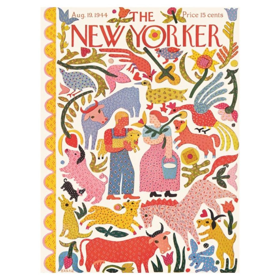
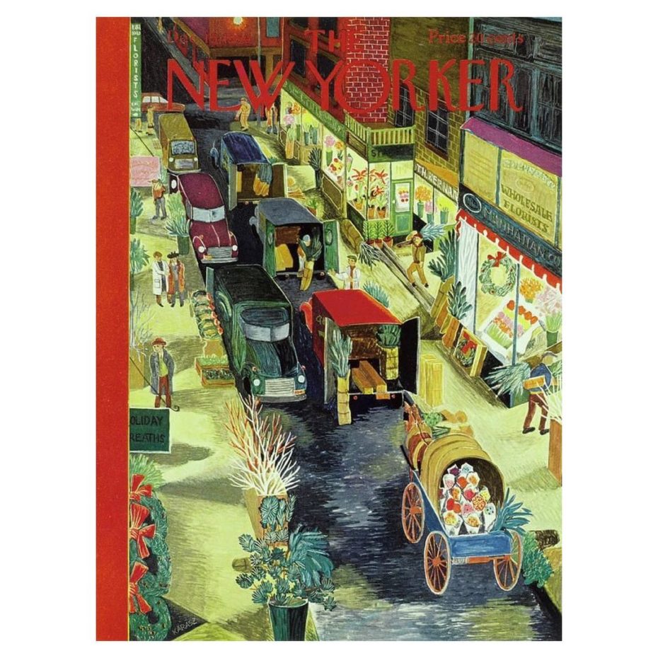
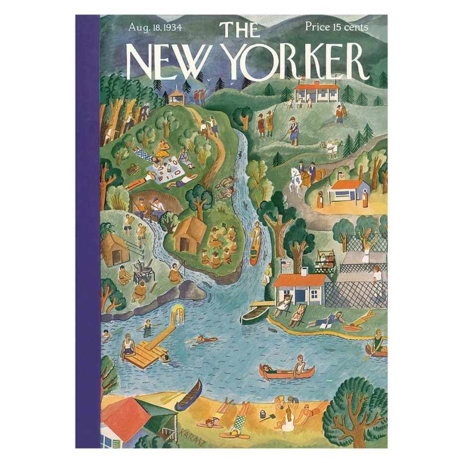
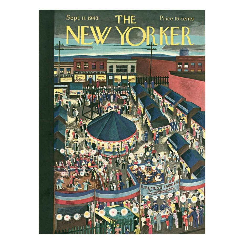
Her most memorable offerings to the world of art and design arguably are her 186 cover designs for The New Yorker. This body of work consisted of magazine covers that reached millions of coffee tables across the USA, they were rare glimpses into Karasz’ daily life, recording the likes of family picnics and scenes in her garden.
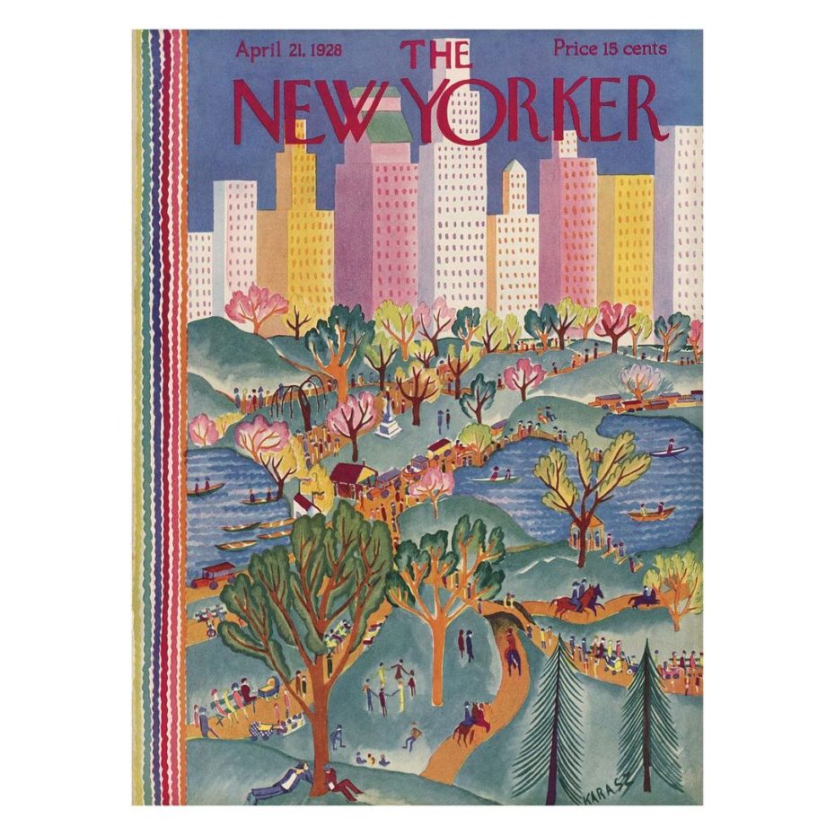
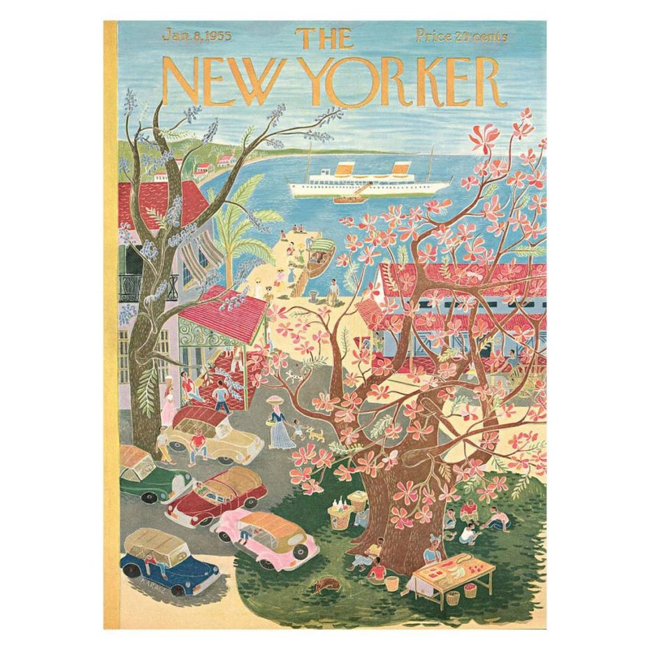
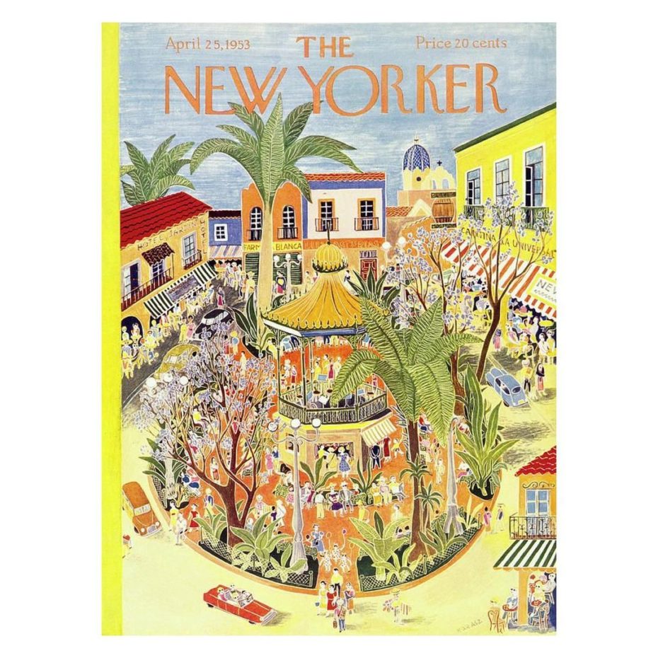
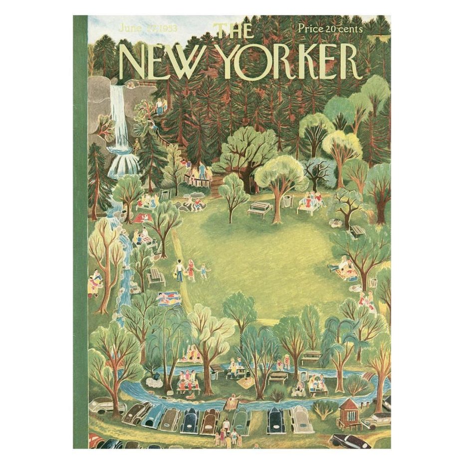
These were snapshots of everyday life in and around the city, often drawn from a birds’ eye view perspective and in unusual colour combinations. Ilonka’s cover-pieces are drawings and paintings of a friendly, inviting and contemporary world, the rise of an arcadian Amercia with its blossoming cities, endless farmlands and cultural highs. Their naivety is their power, offering a glimpse into the modern American paradise. From boxing matches to theatres, snow covered landscapes to florid hats, Ilonka applied her lush, lavish and eclectic illustrative craft in sharing the essence of the mid-century prosperity of her vibrant adopted nation.
Why isn’t she more famous? Her illustrious career spanned from the 1910s to the 1970s and one may speculate that the only reason she isn’t on the tip of everybody’s tongue today is ironically because of her almost unfathomable set of diverse creative accomplishments across the realms of multiple media.
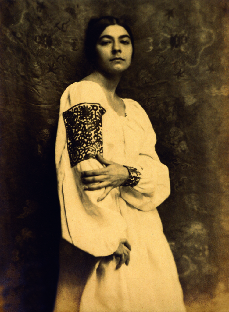
She was touted as “the Hermit Painter”, by famous Greenwich Village character, Guido Bruno, the publisher and editor of Bruno’s Weekly, endearingly referring to the elusiveness and mystique that set her apart from other young beautiful artists of the epoch. Iconic fashion publication Vanity Fair singled her out, elevating her to one of the muses of “New York’s so-called Quartier Latin”. Within the Village’s artist and thespian community, her talent and beauty were legendary. Esteemed New York artists Winold Reiss and Ugene Speicher vied to paint her portrait, photographers like Nikolas Murray yearned to capture some of her mysterious allure.
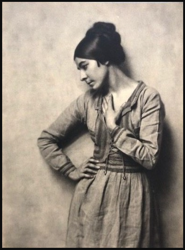
Creative prowess pumped through the Karasz veins. Born in Budapest in 1896, her father was a silversmith, her younger sister Mariska a textile artist and fashion designer. Ilonka became one of the first women to be admitted to the prestigious Royal Academy of Arts and Crafts. At barely 17, confident, adventurous and ambitious, she left Hungary for the United States in 1913 to join her mother, who had emigrated there after her father’s death. From the outset Ilonka Karasz displayed an extraordinary ability for creating eye-catching textile surface designs. While teaching textile design at the Modern Art School alongside American modernist artists Marguerite and William Zorach, she and a few likeminded fellow European artists founded the European-American artists’ Society of Modern Art in 1914, with its publication-mouthpiece Modern Art Collector. As the magazine introduced New York to Ilonka’s stylized floral patterns, book illustrations, cover designs, typography and decorative panels, word of the young Ilonka Karasz’ talent and exceptional design abilities spread like wildfire.
Karasz subsequently founded Design Group, a conglomerate of industrial designers, craftspeople and artists. The fashion magazine Women’s Wear soon started rewarding her for excellence in their textile competitions from as early on as 1918, at barely 22 years of age, dubbing her “one of the best designers of modern textiles”. She was off to a flying start.
At the onset of World War II, she turned her hand to wallpaper design. She managed to capture “the primitive qualities of an American sampler, but the sophistication of the New Yorker,” wrote William Katzenbach (1947), when describing her wallpapers. She was quick to see the benefits of mass production and soon designed with machinery in mind. By 1950, hugely accomplished at layering and transferring images, she was considered America’s most experienced wallpaper designer.
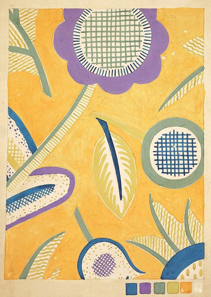
She experimented with all sorts of textile work; her iconic ‘Oak Leave’ pattern was reproduced repeatedly over the decades, another textile collaboration saw her innovative products put to use in a Fokker aeroplane, and two of her patterns were later used in the cars of the Pennsylvania Railroad’s prestigious express train between New York and Chicago.
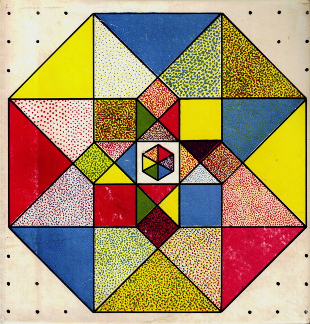
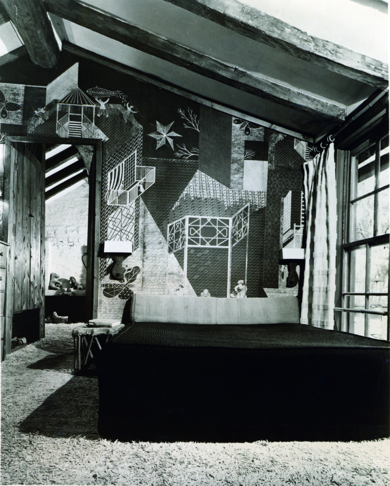
Her contributions in the field of furniture, homeware and silverware coincided with the Art Deco era in the late 1920s and 1930s. Strongly influenced by the De Stijl movement – (think Mondriaan) – her designs were geometric, rectilinear and striking in their simplicity. In 1928, department store Macy’s in New York included Ilonka Karasz’ work with high-brow designers in an exclusive Euro-American exhibition. In the same year she was the only woman to be commissioned by the American Designers’ Gallery in New York to design an entire room. She created not only a studio apartment but a nursery too, which is now considered the first modern nursery designed in America.
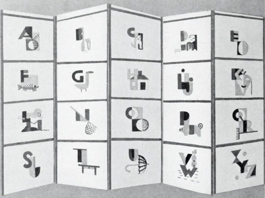
Her nursery designs focused on helping babies and toddlers learn as they develop their spatial, intellectual and dramatic abilities and included, for example, colour-coded doorknobs to stimulate learning. This period coincided with her becoming a mother to two, as well as the emergence of Child and Developmental Psychology as prominent study fields. Always seeing the bigger picture, Ilonka Karasz embraced all aspects of nursery design comprehensively; her approach encapsulated both the physical space and the mental, social, spatial, emotional and intellectual aspects of enclosure. The simplicity and logic of her designs paved the way for a similar ethos in mass production. Having realized the enormous potential of mass production early on in her career, her designs began to incorporate the use of machinery and technology from 1919 onwards.
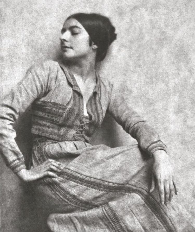
Illonka died in Warwick, New York at the home of her daughter a few weeks before her 85th birthday. Today some of her drawings, wallpaper sample books, rugs and metalware are to be found in the Cooper Hewitt Museum in Manhattan. But her work wasn’t intended to grace the walls of art galleries – in truth Ilonka Karasz was proactive, savvy, practical, enterprising, commercially-minded and eons ahead of her contemporaries. As both an avant-garde and an industrial designer, she broke barriers in what was very much a boys club.
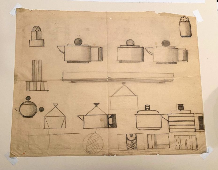
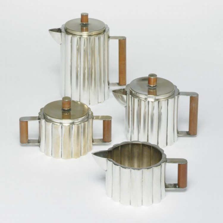
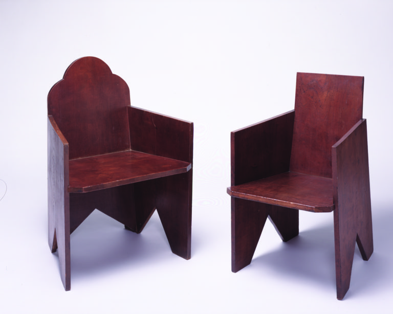
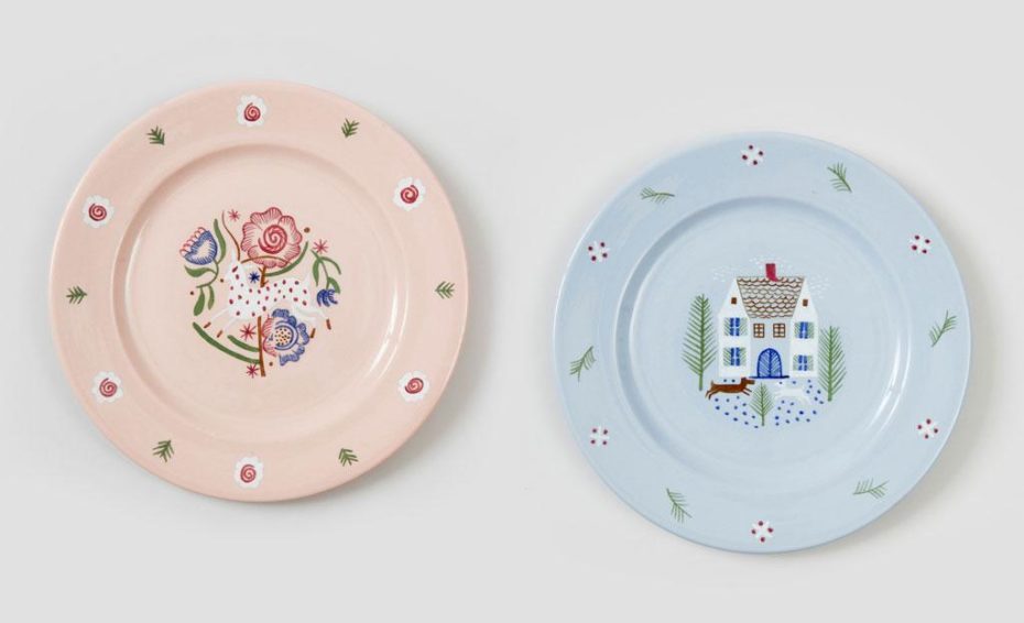
As we speak, American modernist curators are likely to be scouring auction houses for her furniture, crockery and silver, her textile designs and illustrations are in demand by collectors and her railroad china pieces fought over by train enthusiasts. You never know where you might find a Karasz – her signature design style was fluent and adaptable rather than static and specific, which perhaps may have made it less recognisable. Then again, we do love a good treasure hunt.

