Familiar to anyone who pays attention to vintage aesthetics, I’m embarrassed to say it’s taken me 40 years to learn the name of the beloved typographic symbol that been guiding the way for centuries. Alas, that beloved inked symbol in the shape of a pointing hand (often used to draw attention to a section of text) is known as the manicule. Elegant name, n’est ce pas. Once you know the name, this little hand that has survived the march of time can take you down the rabbit hole from the age of quills to the era of cursors. So let’s follow the hand…
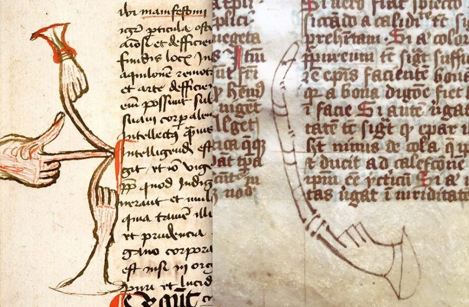
Picture a dimly lit old library somewhere in Europe once upon a time. A monk sits over his medieval manuscript and his eyes are drawn to the margin, where a tiny inked hand with an outstretched index finger is pointing insistently at a line of text. Medieval readers drew these manicules as personalized highlights, effectively the medieval equivalent of a highlighter pen. The practice dates back at least to the Middle Ages: the Domesday Book of 1086 – a great survey of England – contains some of the earliest known manicules added in its margins. Over the 12th through 15th centuries, the symbol became ubiquitous. Scholars scrawled manicules to mark everything from enlightening passages to contentious lines that stirred disagreement or wonder. In fact, one historian suggests that between the 12th and 18th centuries the manicule may have been the most common symbol produced by readers.
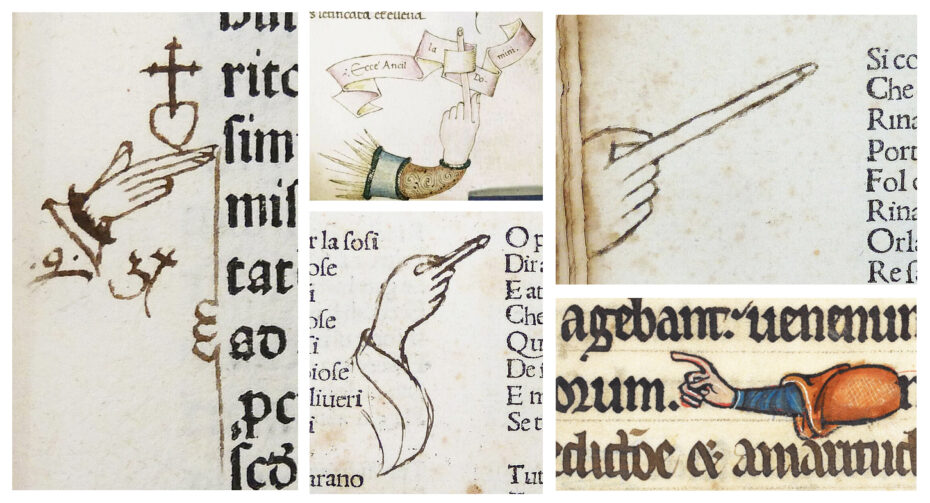
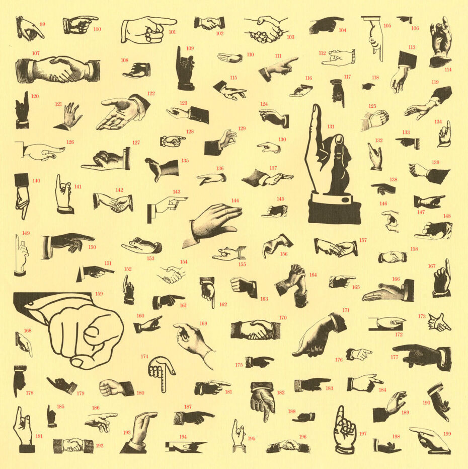
Each reader’s hand-drawn manicule was a little signature of their engagement – some were rendered as simple doodles (two quick strokes forming an index finger), while others became playful mini-artworks, complete with elaborate cuffs and oddly long fingers.
The Italian poet Petrarch famously drew quirky manicules with five fingers and no thumb – an anatomically impossible hand, perhaps sketched in a moment of absent-minded focus. For these book owners, to point a finger in the margin was to shout “Look here!” in the silent language of pen and parchment.
The invention of the printing press in the 15th century might have spelled the end of this handwritten habit – but the manicule proved too useful to vanish. Early printers began casting the symbol in metal type, allowing pointing hands to be printed just like letters on a page.
Historians have traced the first printed manicule to a 1479 book of canon law, where a tiny hand symbol was inked in the text, directing the reader’s eye outward toward a sidenote.
Before long, publishers realized the mark’s value: why leave all the fun to readers’ doodles when the authorities could pre-point at important bits themselves? In early printed books, manicules commonly appeared in the main text pointing at the publisher’s own footnotes or commentary in the margins.
By the 16th century, printers were also dropping pointing hands onto ornate title pages and as decorative dingbats alongside floral marks and ❦ fleurons.
This shift marked a turning point in the manicule’s story. The margin had once been the reader’s playground – a place to physically engage with the text by adding notes and symbols. Now, it was as if the authors and printers said, “We’ll take it from here.” As typography writer Keith Houston observes, “the margin, once the reader’s workspace and sketchbook, was gradually colonized by writers seeking to provide their own explanatory notes or commentaries.”
The humble manicule thus jumped the fence: from an organic reader’s reaction to a premeditated pointer printed by the book’s creators. Still, readers didn’t abandon their beloved little hands overnight. For a while, printed and handwritten manicules coexisted – a dialog of pointing fingers between reader and publisher, each perhaps emphasising different passages for different reasons.
Through the Renaissance and beyond, the symbol’s association with keen insight and commentary only grew stronger. A pointing hand in a text had come to signify, “Pay attention – wisdom here!”

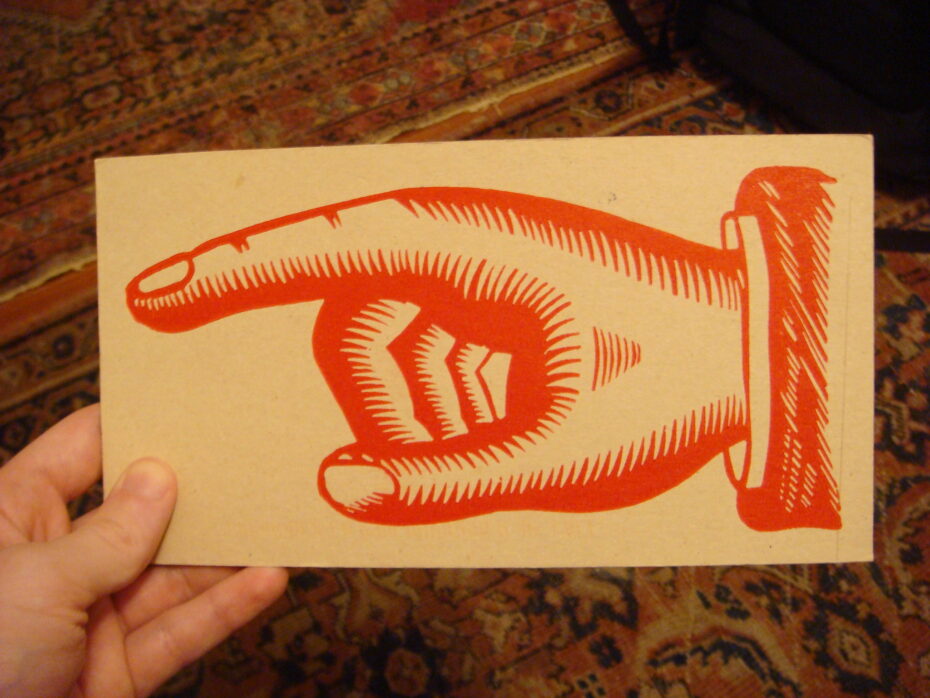
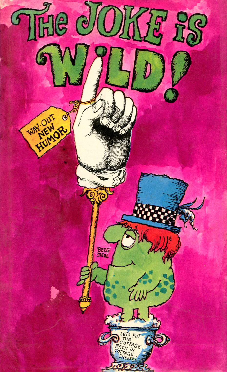
By the 1800s, the manicule had busted out of books altogether and was pointing the way across public life. No longer confined to scholarly tomes, it became a graphic staple of posters, newspapers, and signs. Printers in the booming Victorian advertising industry turned the old-fashioned “little hand” into a big attention-grabber. Manicules were a bread-and-butter symbol of 19th-century advertising, literally pointing the reader toward headlines, punchlines, and points of interest.
They appeared in newspaper ads, broadsides, and playbills, where a finger could lead your eye to the price, the place, or the main attraction. In an era bursting with bold typography and visual gimmicks, the pointing hand was an instantly recognizable device – part friendly guide, part assertive salesman.
Perhaps the most famous appearance of a manicule in this period was on a wanted poster. After President Lincoln’s assassination in 1865, the War Department issued a broadside advertising a reward for the capture of John Wilkes Booth and his co-conspirators. There, beside the bold lettering of “$100,000 Reward!”, a printed hand jutted out, emphatically gesturing toward the reward announcement – as if the poster itself were impatiently urging readers to notice the bounty.
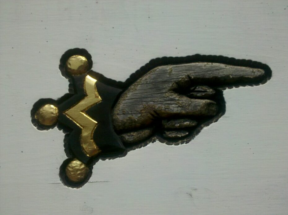
Manicules also found their way onto street signs and storefronts. A pointing hand might hang from a signpost, directing travelers to the nearest railway station or pub. Even gravestone carvers adopted the symbol’s solemn gravitas. Victorian headstones sometimes featured a carved hand eternally pointing upward toward heaven.
By the late 19th century, however, the public had visually overdosed on the once-charming pointer. Like any overused font or logo, the manicule’s ubiquity sapped its novelty. It went from striking to almost comical through sheer overexposure. Printer’s catalogs of the 1880s offered an array of ever-more elaborate hands – fat fists with fancy cuffs and novelty variations – but the craze had peaked. Toward the 1890s the symbol fell out of favour, used sparingly and often with a wink of irony.
As one scholar noted, once the manicule became a standardised, mass-produced typographic element, it lost the personal touch that had made it special. The arrow, a newer and simpler graphic pointer, was also on the rise – by the early 20th century, plain arrows increasingly replaced ornate hands on signs and posters, hastening the manicule’s retreat into semi-obscurity.
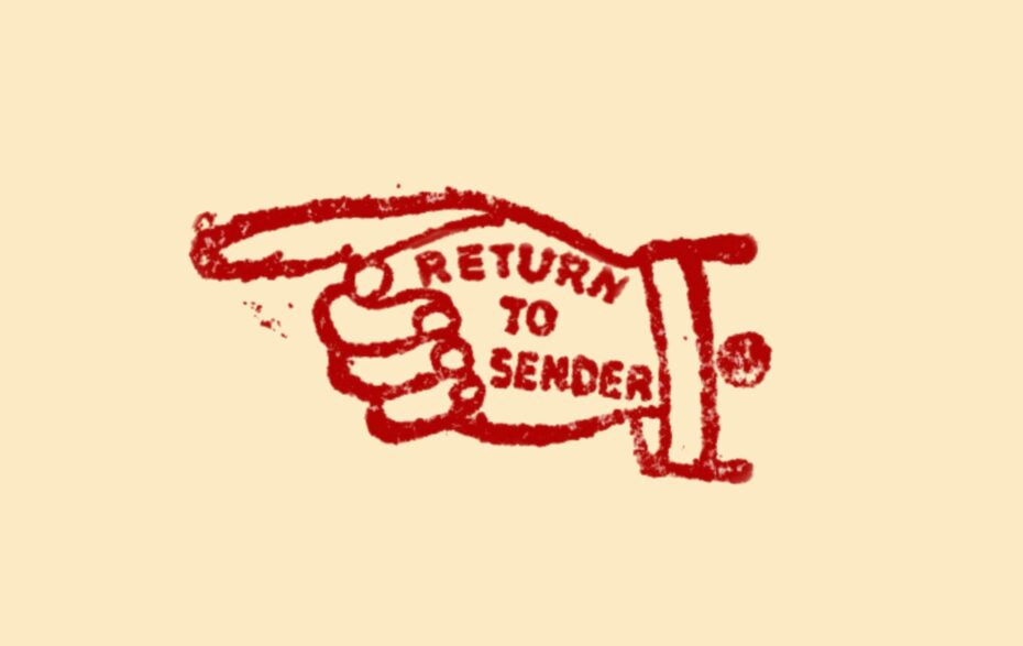
Though it faded from everyday print, the manicule never truly died – it merely went underground, waiting for a new medium. The 20th century gave it a few brief encores. The U.S. Postal Service adopted a pointing hand in its “Return to Sender” stamp, so a misdelivered envelope would come back marked by the iconic gesture. Even if few people today recognize that little hand inked on their returned mail, it’s a direct descendant of the medieval margin mark.
A few witty writers kept the symbol in play as well. American satirist H. L. Mencken reportedly doodled it in telegrams in the 1920s, using the pointing hand as shorthand for his famous quip, “When you point one finger, there are three pointing back at you.” And in his experimental 1973 novel Breakfast of Champions, Kurt Vonnegut peppered the text with a recurring pointer icon at the start of each paragraph, lending the pages the disjointed look of a list of crazy road signs.
Around the same time, novelist Thomas Pynchon paid tongue-in-cheek homage to the manicule’s legacy: in Gravity’s Rainbow (1973), he inserted a cartoon hand with its middle finger extended – a crude parody of the genteel index-finger manicule – to literally point out an obscene joke in the text. Even as formal use waned, the symbol lived on as cultural shorthand for pointing something out – emphatically, and with a bit of humor.
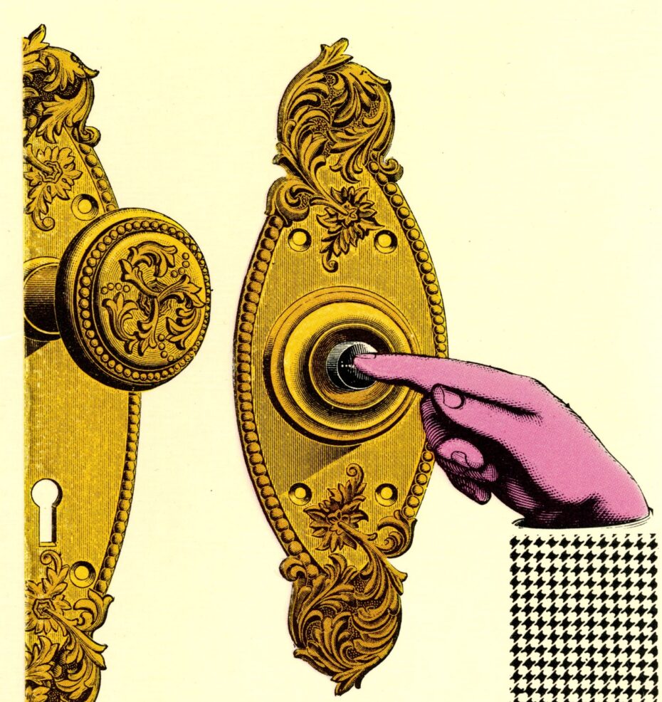
The true resurgence of the manicule, however, came with the rise of computers. It’s no coincidence that one of the first graphical user interfaces – the pioneering Xerox Star system of 1981 – featured a mouse cursor shaped like a pointing hand.
On our modern screens, the manicule found a second life as the universal sign of “click here.” Today, every time you hover your cursor over a hyperlink and see the arrow turn into a little white-gloved hand, you’re witnessing the manicule’s digital avatar at work.
The symbol is baked into the very code of the web: in CSS stylesheets, the code for that cursor is literally named "pointer" – a sly nod to the typographic pointer of old.
Software designers have used variations of the hand icon to indicate everything from draggable objects to interactive buttons. In design terms, it’s a direct continuation of the symbol’s original purpose: drawing attention and indicating interaction. The manicule also sneaked into our fonts and emoji sets. Microsoft’s infamous Wingdings font (1990) included a pointing index hand, and today Unicode officially codifies manicule emojis pointing in all four directions.
With a quick tap on your phone, you can send a friend a 👉 or ☝️ – effectively a tiny digital manicule – to make a point. The medium has changed, but the message is the same.
Today’s vintage-style signage keeps the pointing hand alive. In an age of glossy digital graphics, the old-fashioned manicule has found new roles as a visual throwback. Stroll through a hip neighborhood or a farmers’ market and you might spot a hand-painted sign with a pointing finger, or a boutique logo embellished with a Victorian-style fist. These days, the symbol often appears with a self-aware smile: it evokes nostalgia and kitsch, a wink to the past. Advertisers and graphic designers deploy manicules to give a retro flair to posters and packaging. Restaurant menus and record stores use them on signs to guide customers – a charming gesture that says “step this way” with vintage panache.
It’s a symbol that wears its history on its sleeve (often literally, in the form of a little cuff at the wrist). At heart, the impulse to point things out is timeless and deeply human. We point with our fingers in real life – to direct, to warn, to exclaim – and the manicule has always been a natural extension of that gesture into text. It survived the transition from manuscript to print, from print to pixel, because its core meaning never changed. A pointing hand bridges the gap between reader and writer, margin and main text, past and present. It signals a shared understanding: there is something here worth noticing. Over a millennium ago, some weary scribe drew a tiny hand in the margin to share a spark of insight with future readers. Today, we might send a friend an 👉 emoji to make sure they don’t miss the punchline of a joke, or follow a little hand on a website that says “Click Here.” The technology around us evolves, but that small symbol of guidance and attention remains.